I have wanted to create interactive maps for awhile. I was trying to create them with R and Leaflet (a JavaScript map rendering library) but then R started to piss me off, so I am now learning Python. I discovered that there is a library called Folium that integrates Python and Leaflet. Much excite.
Originally, I wanted to make these maps to show house price growth by neighbourhood in Vancouver. Since I don't have easy access to that data I decided to create a map showing number of Airbnb listings by neighbourhood. Airbnb listing data for major cities can be obtained from Inside Airbnb. I think those poor souls actually web scrape the data themselves.
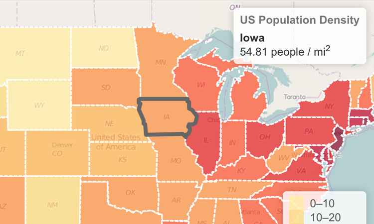
More specifically, I will be creating a Choropleth map. According to the reliable source, Wikiepdia:
"A choropleth map is a thematic map in which areas are shaded or patterned in proportion to the measurement of the statistical variable being displayed on the map, such as population density or per-capita income."
Basically, these things:
Things I learned:
- The basics of how GeoJSON works
- How hard it is to work with GeoJSON data without using GeoPandas
- How much easier my life would have been if I had used GeoPandas in the first place
- How hard it is to create tooltips without using GeoPandas
- How much easier my life would have been if I had used GeoPandas in the first place
import folium
import json
import numpy as np
import pandas as pd
import geopandas as gpd
from pandas.io.json import json_normalize
from pylab import *
import matplotlib.pyplot as plt
1. Create a basic Leaflet map
The first step is to create what is called the "basemap". The parameters are the latitude and longitude of the location (just Google it), the amount to zoom in and the basemap theme. I'm using CartoDB's Positron as my theme.
vancouver = [49.25, -123.1207]
zoom = 10
tile_theme = 'cartodbpositron'

basic_map = folium.Map(location=vancouver, zoom_start=zoom, tiles=tile_theme)

basic_map
2. Add neighbourhood polygons
The next step is to get the neighbourhood shapes (polygons) layered on top. First, read in the GeoJSON data. I obtained the data from this GitHub user, who has GeoJSON files for a bunch of major cities. I also discovered that Inside Airbnb provides neighbourhood polygons with their listings data.
# load in Vancouver GeoJSON data
vancouver_geo = "data/vancouver.geojson"

# create basic map with neighbourhood shapes
folium.Choropleth(geo_data=vancouver_geo,
    fill_color='lightcoral',
    fill_opacity=0.3,
    line_opacity=0.2).add_to(basic_map)

basic_map
3. Colour neighbourhoods by number of Airbnb listings
The map above is pretty boring since it just overlays the neighbourhood shapes over the basemap. If you have data based on geography/area then you can colour the area based on the value of the data for that particular area. First, I will load in the Airbnb listings data. Second, I will count the number of listings per neighbourhood. Finally, I will pass the listing counts along with the polygon data to Folium's Choropleth class to create the map.
The listing counts per neighbourhood are shown below. I dropped Downtown Eastside since there is no census population data for that area, which I need later to scale the listing counts.
# load Airbnb listings data, drop Downtown Eastside
listings=pd.read_csv('data/listings.csv', sep=',',header='infer')
listings = listings[listings.neighbourhood != 'Downtown Eastside']

# count number of listings by neighbourhood
counts = listings.groupby(['neighbourhood']).size().reset_index(name='counts')
counts.sort_values(by=['neighbourhood'])
counts.head()
# create base map
counts_map = folium.Map(location=vancouver, zoom_start=zoom, tiles=tile_theme)

# pass in polygon data and listing counts
folium.Choropleth(geo_data=vancouver_geo,
    data = counts,
    columns=['neighbourhood','counts'],
    key_on='properties.name',
    fill_color='Reds',
    fill_opacity=0.5,
    line_opacity=0.2,
    legend_name='Number of Airbnb Listings').add_to(counts_map)

counts_map
4. Neighbourhoods by number of listings per capita
The above map is OK but all it tells us is that the areas with the most people (and therefore, living spaces) have the most Airbnb listings. It would be better to scale the listing counts by the population of each neighbourhood. It gives us an idea of who actually lives in an area vs. who just owns a place there (a contentious issue in the Vancouver housing market dialogue).
# add population data
census=pd.read_excel('data/CensusLocalAreaProfiles2016.xls', skiprows=3, header=1, usecols = 'C:X', nrows=1) # skip rows is 0-indexed
As can be see in the chart below, Downtown Vancouver has the largest population (not surprising), followed by the Renfrew-Collingwood neighbourhood. I will use the population numbers below to scale the number of listings in each neighbourhood to get a per capita measure.
population = census.transpose().reset_index()
population.columns=['neighbourhood', 'population']

population_sorted = population.sort_values(by=['population'])
population_sorted.plot(kind='bar', x='neighbourhood', y='population');

%config InlineBackend.figure_formats = ['svg']
The graph below shows in the first panel the number of Airbnb listings. The second panel shows the number of listings divided by the area's population i.e. listings per capita. Downtown Vancouver has the highest number of listings and listings per capita. However, the results change for the other neighbourhoods when showing listings per capita. For example, Shaughnessy has the fifth lowest number of listings. However, the area has the fourth highest number of listings per capita.
counts['counts_by_pop'] = round(counts.counts / population.population, 3)
counts_sorted = counts.sort_values(by=['counts'])
counts_by_pop_sorted = counts.sort_values(by=['counts_by_pop'])

# Creates four polar axes, and accesses them through the returned array
fig, axes = plt.subplots(nrows=1, ncols=2, figsize=(12,4))

ax = axes[0]
ax.bar(counts_sorted['neighbourhood'], counts_sorted['counts']);
ax.title.set_text('Airbnb listings by neighbourhood')

ax = axes[1]
ax.bar(counts_by_pop_sorted['neighbourhood'], counts_by_pop_sorted['counts_by_pop']);
ax.title.set_text('Airbnb listings per capita by neighbourhood')

for ax in fig.axes:
    matplotlib.pyplot.sca(ax)
    plt.xticks(rotation=90)

%config InlineBackend.figure_formats = ['svg']
Now, let's look at the number of listings per capita on a map. Areas with the highest number of listings per capita are orange/red. Downtown Vancouver is in red. The orange-red neighbourhood in the middle is Riley Park. I don't want to write out which areas are where and what colour. There should be a way to show this information right on the map when you hover your mouse over an area. ENTER TOOLTIPS. Tooltips show data and labels of a chart when clicking or hovering over areas. In order to create tooltips easily, I realized I needed to use the GeoPandas library.
map_vancouver2 = folium.Map(location=[49.26, -123.1207], zoom_start=10, tiles='cartodbpositron')

folium.Choropleth(geo_data=vancouver_geo,
    data = counts,
    columns=['neighbourhood','counts_by_pop'],
    key_on='properties.name',
    fill_color='YlOrRd',
    fill_opacity=0.5,
    line_opacity=0.2,
    legend_name='Listings Per Capita by Neighbourhood').add_to(map_vancouver2)

display(map_vancouver2)
5. Use GeoPandas in order to add tooltips easily
Below I create a GeoPandas dataframe from the JSON data. GeoPandas basically creates a Pandas dataframe but adds special columns such as geometry.
gdf = gpd.read_file("data/vancouver.geojson")
gdf = gdf[gdf.name != 'Downtown Eastside']

gdf.head()
# merge neighbourhood polygons with Airbnb data
gdf_merged=gdf.merge(counts, left_on='name', right_on='neighbourhood', how='left').fillna(0)
gdf_merged.head()
I also had to create a custom colormap since Folium's .Map function can't do it itself. The .Choropleth function was able to do it. All this work just to get some fancy tooltips! Below I take the Yellow-Orange-Red colormap from Matplotlib, extract their RGB numbers and convert them to hex numbers (Folium only takes hex numbers apparently...)
cmap = cm.get_cmap('YlOrRd', 6)

YlOrRd = []

for i in range(cmap.N):
    rgb = cmap(i)[:3] # will return rgba, we take only first 3 so we get rgb
    YlOrRd.append(matplotlib.colors.rgb2hex(rgb))
    print(matplotlib.colors.rgb2hex(rgb))
variable = 'counts_by_pop'

gdf_merged=gdf_merged.sort_values(by=variable, ascending=True)

colormap = folium.LinearColormap(colors=['#fee187','#feab49','#d41020','#800026'],vmin=gdf_merged.loc[gdf_merged[variable]>0, variable].min(),
                                 vmax=gdf_merged.loc[gdf_merged[variable]>0, variable].max()).to_step(n=4)
colormap.caption = "Number of Airbnb listings per capita"

colormap
Aaaaand, Voila! Hover over the areas on the map below to see the number of listings per capita and the neighbourhood name.
m=folium.Map(location=[49.26, -123.1207], zoom_start=10, tiles='cartodbpositron')

folium.GeoJson(gdf_merged[['geometry','name',variable]],
               name="Airbnb in Vancouver",
              style_function=lambda x: {"weight":0.5, 'color':'grey','fillColor':colormap(x['properties'][variable]), 'fillOpacity':0.6},
              highlight_function=lambda x: {'weight':1, 'color':'black'},
               smooth_factor=2.0,
              tooltip=folium.features.GeoJsonTooltip(fields=['name',variable,],
                                            style=('background-color: white; color: black;'),
                                              aliases=['Neighbourhood','# listings per capita'],
                                              labels=True,
                                              sticky=True)).add_to(m)

colormap.add_to(m)

m